F1 News

Analysis MCL35: Slimmer, more components and tighter
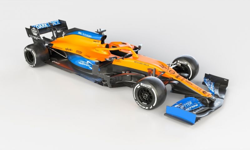
After McLaren's presentation of the MCL35 this afternoon, many images of the new car have been released and they provide an overview of the most important changes compared to last year. Apart from the colour scheme and new sponsors on the livery, the car also comes with technical changes and that ensures that the car is quite different. It has mainly become a leaner car with which the team will compete with the top teams.
The roll bar
One of the striking points about the design of the MCL35 is that the air inlet at the roll bar has taken on a different shape and also consists of more compartments. In addition, the superstructure is also slightly narrower by becoming wider afterwards, instead of consisting of a more oval part.
Front wing
The front wing has changed reasonably compared to the MCL34, because the wings now bend more downwards, so that the wing parts on the sides are lowered. The nose of the car is simplified in that context, since the nostrils are no longer present. Instead, the elements hanging on the nose are purely the brackets that hold the wing on the car.
Other adjustments
The mirrors have also been given a new design, because instead of sticking from the side, they are now mounted on the edge of the cockpit in terms of starting point, with an angular stand that is similar to what Red Bull Racing has this year. On the side you can also see that the sidepods of the MCL35 consist of more elements and therefore look a bit more complex.
It is also noticeable that the suspension is mounted higher this time and that the steering rod is now in line with the lower support arm. The entire nose itself is similar to that of the MCL34, although it looks slightly narrower. McLaren also does not opt for 'Viking horns', which Red Bull has on the car this year.
In cooperation with GPBlog.com.nl and Lennard Verhage